Ideas Are Like Pixies
- The Archivist
- Jun 28, 2024
- 8 min read
Specifically the ones from D&D and Pathfinder lore: mischievous, curious, and--my new favorite word; thank you, Paizo--puckish.
Think about it. How often have you, the software designer, the data analyst, the novelist, the fashion designer, the student, picked at a gnarly problem only for it to snarl further under your fingertips? Frustrated, exasperated, done with it all, you throw your hands up and abandon the problem to go take care of that mountain of dishes in the sink because they're attracting flies. Or maybe you go shower because, man, has it already been 5 days? Or maybe you go for a calming walk because you don't remember what the sun looks like and you can feel your legs atrophying from sitting at the computer too long.
You know, menial tasks. Your brain shuts off, grateful for the reprieve, you sing your heart out to some Celine Dion, and--oh look! a monarch butterfly!
Then, *BAM*, you get sucker punched in the face by that puckish little pixie. While you're reeling from the obviousness of the solution to your problem, the diminutive, smarmy bastard giggles derisively at you.
And just as you're recovering, it flutters off! Hurry. Better capture it while you can, lest you lose the tricky bugger.
For me, this happened yesterday while I was finishing the mockup for my homepage and perusing a list of inspiring websites for future inspiration. Funnily enough, I don't remember anything about the list itself, but the author's words plucked a very specific string in my mind:
"Websites are a powerful tool for storytelling."
Earth shattering. Absolutely earth shattering.
Websites Are a Powerful Tool for Storytelling
I'm a storyteller at heart. I enjoy finding new and unique ways of telling stories outside traditional formats. Composing music to complement the story and writing the story in heroic couplets to complement the music was one of the greatest joys and challenges of my senior music composition recital in college. Writing the story in such a way so that the rhymes weren't ostentatious or always obvious was an added bonus. At the time, I noticed a remarkable similarity and synergy between the meter I chose for each chapter and the meter of the corresponding piece I composed. Drawing connections between these two mediums ignited my creativity in ways that neither could have on their own.
Fast forward to Sunday of this week, mid-afternoon. I'd just finished working out and was contemplating what to pursue next. Since I was feeling creatively tired--I had written for a majority of the morning--I looked to Skillshare to recharge. The question was, what should I learn? I'd been putting off diving into web design because I was hyper-fixated on writing, but my overall writing pace was slowing again. 'Eh, why not?' I thought, and typed "Web Design" into the search bar.
I...wasn't impressed with the learning paths, which centered on working with Webflow or Word Press. I cared little about either option, but I was also reticent to watch through just a singular class relating more closely to my needs.
Step 1 to Creative Revelations: Explore, Research, Learn, Let the Mundane Wow You
Clicking the "Browse" drop-down menu, "UI/UX Design" captured my attention. Now, mind you, I had no idea what UX was. I intuited that UI meant "user interface," since that's common enough, and having watched a few of the videos within the class, "Intro to UX: Designing with a User-Centered Approach," by Cinthya Mohr, I quickly learned that UX = User Experience. Okay, cool. It wasn't the class I was wanting, but it piqued my curiosity just enough because it was tangentially related to my goals. Plus, it encouraged me to think about my website from a different angle.
When people visit "Fear No More," what experience am I hoping to give them? Obviously the site is nowhere near what I want it to be. As of the time I'm writing this entry, I haven't uploaded a single finished project or W.I.P. to showcase my current or past journeys or skills (oops). All I have are the blogs I've written and the examples showcased within.
Before Cinthya's class, I never really considered my website a "product." I'm not selling it, and I have nothing to sell on it yet. But what if? What if I viewed it through the lens of a product while I watched her 4th video, where she listed out her "10 Rules of Good UX"?
Broadening my definition of what constitutes a product allowed the sluice gates to open a fraction so that the first set of ideas could trickle through.
Idea: Implement fun uses for buttons on FNM
Idea: Create a forum page
Idea: Main banner for site is a lone figure facing the shadow of a great beast. The figure is androgynous, their cloak swept to the side by a gust of wind. They hold a gleaming sword in their hand & are surrounded by runes (pictographs of various items? quill, harp, etc...)
Keep this one in mind as we move forward.
I was buzzing with excitement, but alas, other priorities required my attention, so I set Skillshare aside for the day.
Step 2 to Creative Revelations: Let the Ideas Percolate
All throughout Monday, I let the above pixies tinkle lightly in the back of my mind. My fiancé was off work, so we spent the day together.
Step 3 to Creative Revelations: Revisit the Main Point of Interest
With the question, "What experience do I want visitors to have on my site?" I returned to the search bar on Skillshare. I was glossing over some web design courses when I thought to look for classes specifically related to designing a website via Wix. It was a real, "Duh," moment, but sometimes I'm slow to piece the most obvious conclusions together.
I was in luck! "How to Design a Website From Scratch With Wix: The Only Wix Web Design Course You'll Ever Need" by Caleb Jost may as well have had flashing neon arrows pointing at it.
Some of the information and videos were irrelevant, since I had already completed such steps as choosing my plan, but the rest carried the light chimes of distant pixies to chase, especially the tools Caleb suggested for experimenting with color palettes.
Coolors is a really nifty site, y'all. I may have spent a little too much time playing with colors.
Palette 1  | Palette 2  | Palette 3  | Palette 4  |
Palette 5  | Palette 6  | Palette 7  | Palette 8  |
Palette 9  | Palette 10  | Palette 11 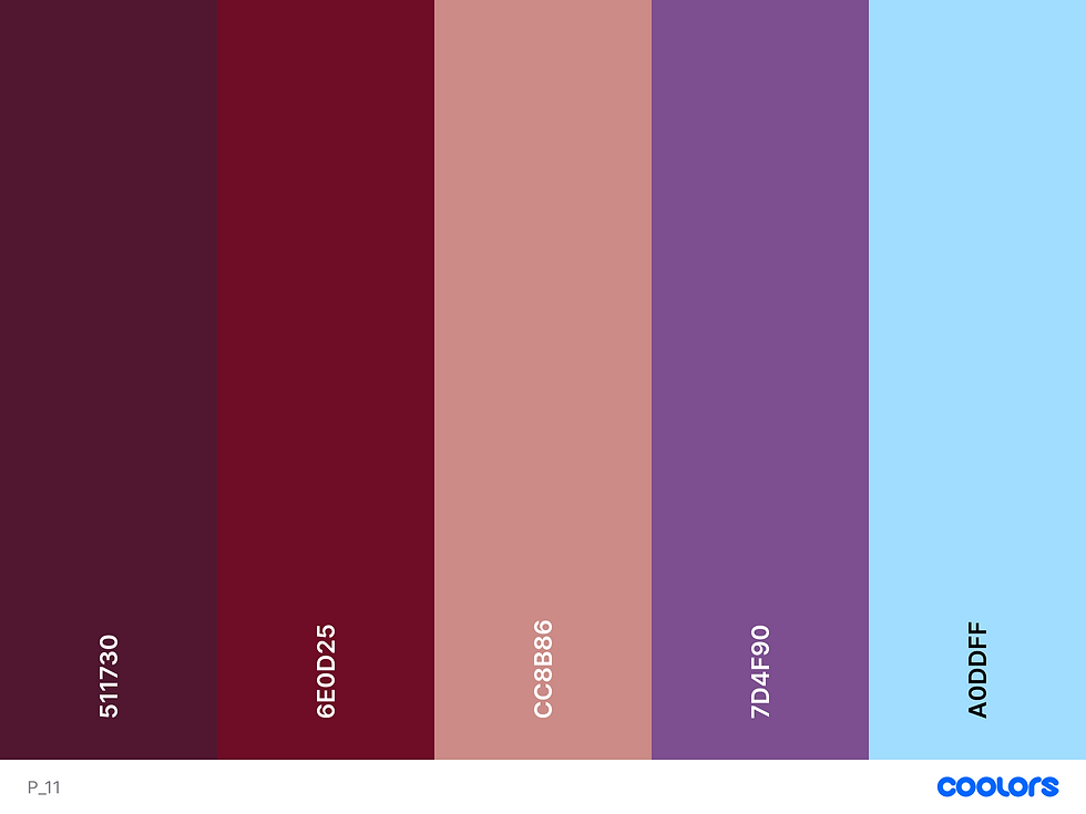 |
Palettes # 4 and # 11 are my favorites, so I've pinned both as possibilities for the new color scheme for Fear No More. I think I'll have a better idea of which one I want to use when I actually begin adding color to the mock-up draft I've designed.
Instead of focus on the entire homepage at once, I thought it best to start small. After collecting a decent series of color combinations, I briefly tinkered with logo ideas. A vast majority of that, however, happened on Wednesday.
Step 4 to Creative Revelations: Start with What You Have & Learn as You Go
I mainly wanted to work on the logo because I didn't want to overwhelm myself by focusing on the entire homepage all at once. Plus, one of the first tasks Caleb completed in his series was to design the logo for the pretend travel blog example. Wanting to follow his example, I cracked my knuckles, set his series on pause, and searched for, you guessed it, Logo Design on Skillshare and found an absolute comedy gem in Aaron Draplin.
I watched through his "Logo Design with Draplin: Secrets of Shape, Type and Color," within the "Master Typography and Logo Design with Aaron Draplin," learning path even though I have neither access to Adobe Illustrator nor any desire currently to use any Adobe products. I might consider designing a family crest someday, but I balked at the idea when that was the class project. I simply haven't the interest. I did, however, use his teachings to start piddling around with basic designs.


I focused primarily on typography, since it formed interesting constraints within which to work. I liked the possibility of making a quill out of the F, but it didn't quite match the aesthetic I wanted. I moved onto the N and M, hoping to glean some inspiration from those letters that would spiral closer to what I wanted. I was right to move on.
The M, when drawn a certain way, looked like a cloak to me. The N and M combined at the right side of the first page looked like the start of a person with long hair wearing a cloak. The trouble was implementing the F into the design and making the N more visible, embedded into the M as much as it was.
I pulled a new sheaf of paper toward me and began again, drawing the M-cloak with the N nestled into where the mantle would be. I was still stuck on the F, because how do you conceptualize such an abstract emotion as fear? Fear can take many shapes. It is the darkness of the unknown and the unknowable. It is the monster that--oh. Oh ho ho ho. Well now! Let's make the F into a monster then, shall we?
Was I satisfied with just that though? No! How else can we bend the rules and boundaries of this increasingly complex logo?
Oh, I know. Let's find a way to use every single letter in "Fear No More" within the design itself.
Step 5 to Creative Revelations: Work Within Constraints
But how?
Well, the F was easy. The o in "No" as well. People need heads, after all. Unfortunately, as I worked, I quickly realized that the design was going to be far too complex for just a logo.
Welp! Homepage it is then!
I'll leave the other letters up to your imagination.


The kicker? Remember that bit I told you to remember earlier on in the post?
"Idea: Main banner for site is a lone figure facing the shadow of a great beast. The figure is androgynous, their cloak swept to the side by a gust of wind. They hold a gleaming sword in their hand & are surrounded by runes (pictographs of various items? quill, harp, etc...)"
I wasn't even actively thinking about that particular image while deep in the designs, yet it somehow came to fruition naturally during the process, not in its original form, obviously, but the connections are there. Thank you, subconscious!
You'd think that by now I would have also had the revelation that websites are a powerful tool for storytelling.
Yeah, no. Aside from some general notes about the site Header detracting from the mockup and, oh, maybe I could make it a closed scroll that opens up when you click on it, my focus was once again on logo design.
Step 6 to Creative Revelations: Lather, Rinse, Repeat in Your Desired Order
In my quest to resume designing the logo, yesterday, I began watching "Logo Design: How to Create a Unique & Memorable Wordmark" by Khadija El Sharawy. While I enjoyed watching Draplin's step-by-step approach to designing his family crest, I resonated more with Khadija's ability to present information in an easily digestible way for the purposes of taking notes.
Still, my mind wasn't on wordmark. I was more curious to know how I could simplify the homepage into a recognizable logo. The candelabra? The top half of the little archivist guy? The eye of the monster but closed?
I had already been designing the homepage most of the morning and afternoon. My mind was tired, and I was easily distracted. I wanted to keep collecting inspiration though, so I visited a site that listed some web design trends and scrolled through that. Micro animations, scrolling animations, monochromatic designs, there's so much you can do depending on your wants and needs!
From there, I hopped to the next site, just to see what similarities and differences it held compared to the previous, when *BAM,* I was sucker punched.
"Websites are a powerful tool for storytelling."
The culmination of an entire week encapsulated within a single quote. "Fear No More" needn't solely be an archives. The site itself can also be a story, sprinkled with Easter eggs as my skills grow and develop. I needn't be constrained to the canvas. No, I can paint the very walls, because this is my house!
Thank you, puckish little pixie. You're mine, now.
Other Notable Accomplishments
Seem to have fully recovered from last week's injury and thus managed to work out consistently all this week.
Wrote a little bit toward the beginning of the week, but then the rest was dedicated to the above
This Week's Obligatory Cat Pic: Mura

I typically get those "Aha" moments the moment i wake up in the morning. Usually its something to do with a script in Unity where every solution ive been attempting is over complicated. Then BAM lol. Its a good feeling for sure.